Friday 29 October 2021

We love this new collection in the showroom ...

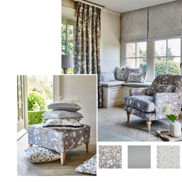
 It’s never too late, or early, to breathe fresh life into a room with these wonderful floras and airy fabrics.
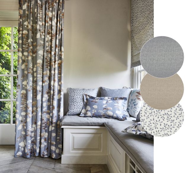
Referencing the flora and fauna of the English countryside, the new Meadow Collection from PT brings together five designs embracing bark textures, eucalyptus stems and watercolour florals in a palette of soft, muted pastels. Meadow combines sustainably sourced cotton and recycled polyester in a collection of prints, jacquards and embroideries.   We’re exploring the popular Blueberry colourway.

Layer it Up


Evoke the wild nature of the outdoors by adding embroidered textures in pastel colourways for a great look.

Experiment with the floral prints and embroidered textures to create layers and immerse yourself with these modern, sophisticated designs. Pairing textures with muted tones can introduce a delicate balance in any room, perfect for unwinding.
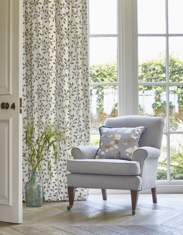
Keep Nature in Mind


Imitate the feel of natural elements by playing with sustainable textures and fabrics.

To further reflect nature, incorporating organic materials is both a stylish and eco-friendly option. Part of the new PT Eco range, the Meadow collection can help you achieve this look featuring sustainably sourced cotton and recycled polyester.
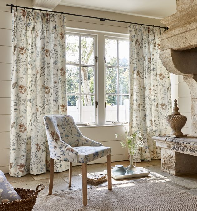
Cohesive Cocoon


Add an inviting touch to any space by refreshing your space with powdery tones such as pastel blues and warm jute shades.

Earthy tones can warm up a space and these shades can be added through drapery or upholstery to help tie a room together. Muted colourways are grounding and are perfect for intimate seating areas such as a living room or dining area.
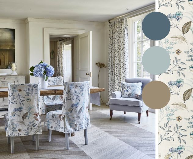
Make it Last


A trend that keeps coming back, dainty botanical prints and neutral tones are here to stay.

Calming tones are suitable year-round and are a great way to instantly refresh your space. Keep adding to the theme by upholstering furniture or adding scatter cushions with leafy prints in shades such as greens, blues, and beige. Introduce embroidery for a lasting finish.

Modern Rustic


Embrace a modern element to traditional prints

 to update your interior.

Use floral prints in modern hues to reinvent the whimsical theme. Soft tones can evoke the relaxing quality of nature whilst keeping a rustic feel.

The delicate Verbena print from the Meadow collection features a painterly flora motif in a series of six understated colourways for a more contemporary feel.

Is it time to welcome an uplifting country garden feel
into your home with fabrics from the Meadow collection?

The full range of fabrics can be viewed in our showroom.


Wednesday 12 February 2020

Get That Stylish Look With Bespoke Luxury Venetian Blinds

Origins Collection
Wood Venetian blinds have become a really popular choice for the style conscious - mainly because they have a timeless simplicity, suit any area of the home, are super functional and always look great! 

They are also very affordable, which always helps.

​As well as our popular 'Essentials Wood' 
range we are now offering an exciting new range  - hand crafted and made to measure in the UK. This more luxurious 'Premium Wood' range offers a much wider choice of finishes with seven collections to choose from. 


1. The Purist collection
A selection of eight glamorous shades of 'white'. From 'Stark' white through to creamy 'Alabaster', there is sure to be a shade to suit.

2. The Santa Fe Collection
This collection offers a smooth painted finish in some of the most popular neutral colours, such as hessian, Clay and Truffle (shown below). There are five colours with a matt finish and eight with a high gloss finish including a deep black called 'Sin'. 
Santa Fe collection - colour Truffle


3. The Mode Collection
Featuring a high gloss lacquer this Collection offers eight bright shades to bring a pop of colour to any room. With their almost mirrored finish, and the option to mix and match slat colours, this collection offers the possibility to make a truly eye-catching statement.
Moda Collection with colour Lulu as feature slats with Lulu Tapes


4. The Stains Collection
From the palest 'Sandwash' to the blackest 'Jarrin' (shown below) the Stains Collection offers ten smooth and subtle natural wood grain effects.

The Stains Collection colour Jarrin
5. The Origins Collection 
This 50mm collection offers five wood effect tones which subtly embrace the texture of natural timber grain. 
The Origins Collection


6. The Zebrano Collection
The Zebrano range oozes rustic urban chic, with four spectacular tonal designs to choose from. The inspiration behind the unique design combines the look of exotic hardwood with a deep tonal stripe effect.


Zebrano Collection colours Cassia and Matumi

7. The Deep Grain Collection 
This collection offers eight neutral painted tones on the 'greige' scale - from ivory, through taupe to deep grey. As the name suggests these painted slats have the greatest textural quality of all the collections. 
The Deep Grain Collection


Ladder Tapes 
All collections are also available with luxury ladder tape. This covers the traditional punch-holes that run through the slats and really gives the Blind a luxury finish. The Premium Wood Collection has a wide choice of tape styles and colours - the matt Flatwave tapes (18 colours), Two-Tone Stripe tapes (8 colours), the colourful Mode tapes (8 colours) or the luxe metallic Fusion tapes (6 colours).

Shown with Two Tone Stripe Tape in colour 'Drama' 


Timberlux ™ Premium Wood Blinds are a luxurious collection of UK 
made to measure handcrafted Basswood Venetian Blinds.


Thursday 28 March 2019

Living Coral - a New Spring and Summer Colour Combination


Every year, colour experts "Pantone" pick the shade they predict to be the Colour of the Year. The decision is influenced by all aspects of the world we live in – fashion, art and design, as well as lifestyles.

For 2019, the colour experts have chosen 'Living Coral', an energising shade that embraces softness, warmth and comfort. 

As we’re heading into spring, we're featuring the Tresco fabric collection which pairs the Colour of the Year with vibrant turquoise shades. It's a colour combination that cheerfully reflects the contrast of living coral in the ocean. 


Tresco combines digital prints, bright embroideries, woven leafy motifs and a coordinating damask in a spirited scheme for the modern home. This bright colour palette works perfectly when updating your home for spring and summer.

As Pantone describes 'Living Coral' as a sociable, nurturing colour, the shade is most at home in communal spaces such as living rooms, kitchens and dining rooms.


It’s also easy to add touches of these coral and turquoise shades into a more neutral living space. Incorporating cushions and curtains in fabrics such as Trebah and Abbotsbury give a vibrant, yet fresh look for spring or summer. 


Originally inspired by coral reefs, the colour is easily associated with summer. However, the warm coral shade, combined with terracotta and a deeper teal, offers the perfect means to re-energise an interior ready for the warmer months.


Discover the new Tresco Collection at Grasshoppers Interiors


Friday 9 November 2018

Metallic Minimalism

Metallic Minimalism is this year’s must-have winter interior trend, incorporating pared back metallic patterns to give an understated warm glow to your living space.
Metallic Minimalism compliments simpler interiors with iridescent patterned accents that reflect light and add focal points of soft luminosity.
Although softer metals work well alongside winter neutrals, metallic minimalism can also compliment darker colour schemes in simple living spaces. Adding these warm, reflective surfaces adds another dimension to what could sometimes be considered a flat interior.
As well as the traditional silver and gold, softer bronze shades enhance a moodier interior and work in harmony with a variety of bolder colour schemes.
So, whether you pair metallic minimalism with classic colour palettes or incorporate it into interiors with a darker feel; it is the perfect way to incorporate the metallic trend into your home.


Monday 16 October 2017